Master Artist
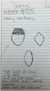
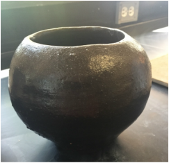
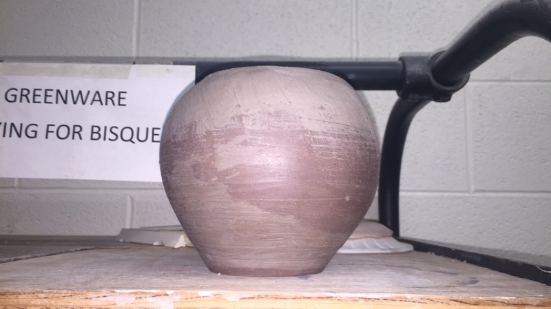
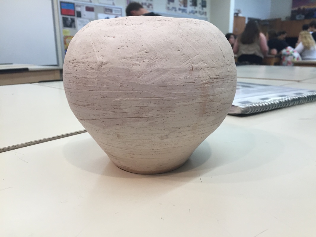
For this project we had to mimic a master artist's work, or use their technique to create our own work. My master artist was Maria Martinez, she was a famous coil pot builder who recycled clay from the environment. Since I mainly work with coil building, I decided that I would choose an artist that uses that technique to create her own art. For this I decided to make a pot that took on some of her early forms. I used a mix of clay to give an unique look. Initially I had a different vision for this piece, but it did not turn out how I wanted. Part of me wished I would've just glazed it clear and called it a day. However that did not happen. For my glaze I went for a deep brownish-blue which would've looked awesome if that's what it actually turned out as. Instead I got a lumpy brown, which actually looks horrible. It ruined the whole pot. I mixed the glazes shino and midnight blue with detrimental effects. In the end, I thought this project was going to turn out to be my best, instead it became my worst. (you'll notice I had a different artist in my sketches, however I changed my mind shortly after)
For this project we had to mimic a master artist's work, or use their technique to create our own work. My master artist was Maria Martinez, she was a famous coil pot builder who recycled clay from the environment. Since I mainly work with coil building, I decided that I would choose an artist that uses that technique to create her own art. For this I decided to make a pot that took on some of her early forms. I used a mix of clay to give an unique look. Initially I had a different vision for this piece, but it did not turn out how I wanted. Part of me wished I would've just glazed it clear and called it a day. However that did not happen. For my glaze I went for a deep brownish-blue which would've looked awesome if that's what it actually turned out as. Instead I got a lumpy brown, which actually looks horrible. It ruined the whole pot. I mixed the glazes shino and midnight blue with detrimental effects. In the end, I thought this project was going to turn out to be my best, instead it became my worst. (you'll notice I had a different artist in my sketches, however I changed my mind shortly after)
|
|
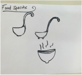
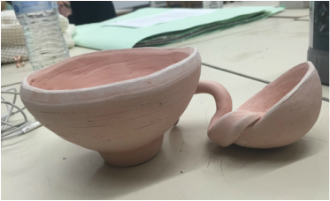
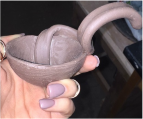
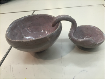
Food Specific
This project entailed creating a piece that served one function for a certain type of food. I decided to make a ladle, and for those who don't know what that is, it's used for soup. I made my ladle smaller than anticipated, but I think it could serve its purpose well. While making this project, I struggled on two main things. How will I make the handle? As well as, how will I get the ladle to balance. Throughout my experience, I only came to solve one of those problems. The ladle itself was able to balance on it's side, and looked better as a decorative piece rather than a real ladle. The handle for me wasn't as good as I had hoped. It was too bulking which weighed the ladle itself down. You'll see in the pictures I made another piece. Since my ladle was so small, I decided to make a bowl to accompany my ladle. So in the end I made a big "spoon" and a bowl to match. I'm not going to go into a big fuss about the glaze, because it happens to me every time. The glaze on this particular set came out a smooth purple. It was supposed to be a cream color with red accents, but that is okay. It honestly could have been a lot worse. Overall this project was fun, it would've been better if we had more time and more clay!
This project entailed creating a piece that served one function for a certain type of food. I decided to make a ladle, and for those who don't know what that is, it's used for soup. I made my ladle smaller than anticipated, but I think it could serve its purpose well. While making this project, I struggled on two main things. How will I make the handle? As well as, how will I get the ladle to balance. Throughout my experience, I only came to solve one of those problems. The ladle itself was able to balance on it's side, and looked better as a decorative piece rather than a real ladle. The handle for me wasn't as good as I had hoped. It was too bulking which weighed the ladle itself down. You'll see in the pictures I made another piece. Since my ladle was so small, I decided to make a bowl to accompany my ladle. So in the end I made a big "spoon" and a bowl to match. I'm not going to go into a big fuss about the glaze, because it happens to me every time. The glaze on this particular set came out a smooth purple. It was supposed to be a cream color with red accents, but that is okay. It honestly could have been a lot worse. Overall this project was fun, it would've been better if we had more time and more clay!
|
|
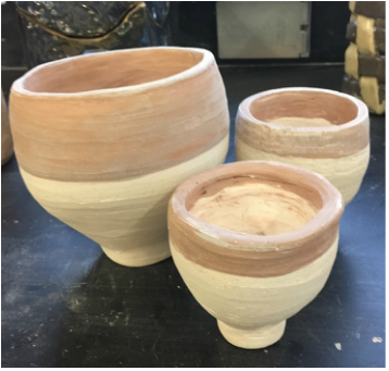
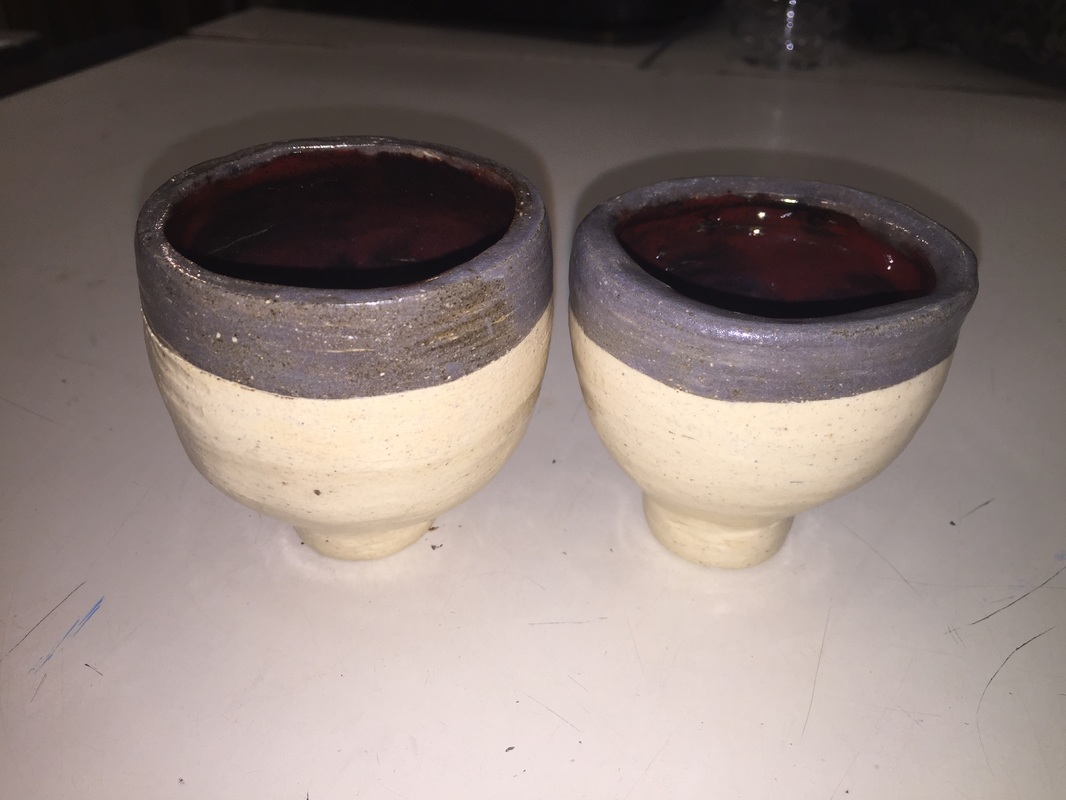
Colored Clay
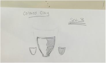
For this project we were supposed to create an object that incorporated two different colors of clay. I didn't actually follow my design at all for this project, and I really noticed the lack of organization in my final product. We had to make a set, so I decided to approach in a different manner. Instead of making three things that all had a common theme, I made three identical pieces that consisted of different sizes. I took my inspiration for the colors from a flower pot shape, hence the picture below. The two small pieces I felt were the worst, mainly because I was pressed for time and could not get an even shape. I larger one was my favorite because it was somewhat symmetrical and clean cut. (once again I built these pots out of coils) For my glaze I decided to let the colors of the pots show and paint a clear coat over top. On the inside however I was aiming for a deep burgundy by mixing red and black glaze. Overall this project for me was very frustrating, and would probably take a different direction my second time around.
For this project we were supposed to create an object that incorporated two different colors of clay. I didn't actually follow my design at all for this project, and I really noticed the lack of organization in my final product. We had to make a set, so I decided to approach in a different manner. Instead of making three things that all had a common theme, I made three identical pieces that consisted of different sizes. I took my inspiration for the colors from a flower pot shape, hence the picture below. The two small pieces I felt were the worst, mainly because I was pressed for time and could not get an even shape. I larger one was my favorite because it was somewhat symmetrical and clean cut. (once again I built these pots out of coils) For my glaze I decided to let the colors of the pots show and paint a clear coat over top. On the inside however I was aiming for a deep burgundy by mixing red and black glaze. Overall this project for me was very frustrating, and would probably take a different direction my second time around.
|
|
|
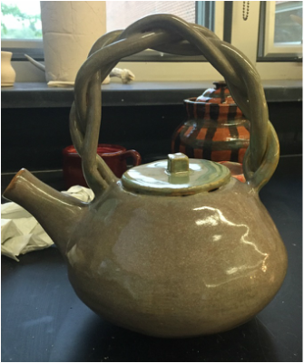
Lidded Vessel Project
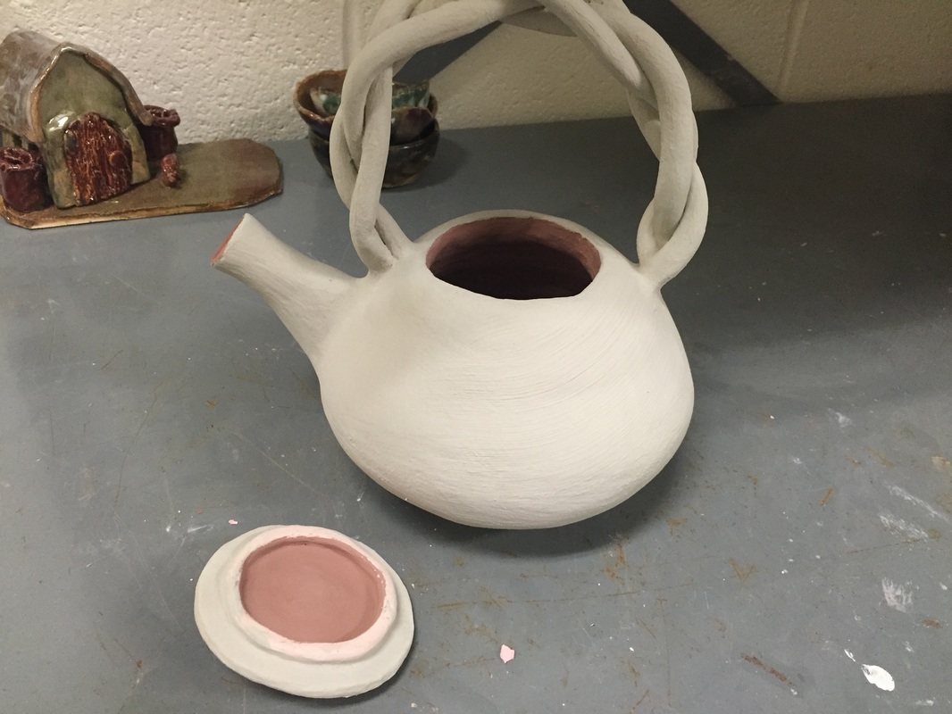
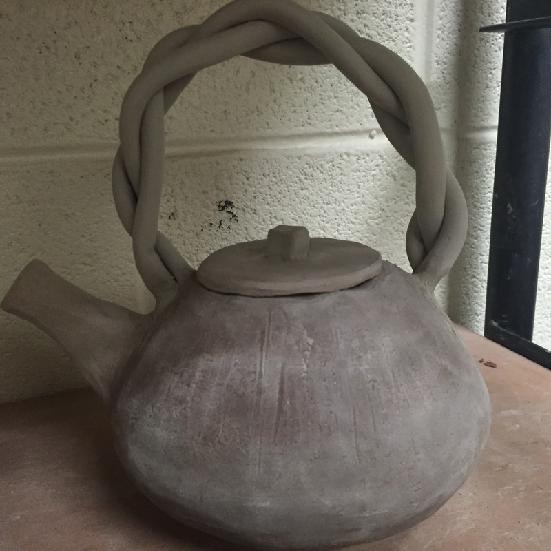
For this project we were supposed to make a vessel (ie something that holds another) with a lid designed to fit in it or around it. I decided on making a teapot with a braided handle that rose above the lid. My initial design was to make a smaller teapot that attached to the side of the pot, however I was not able to that because my pot was too big. I made my base pot out of coils and eventually trimmed it on the wheel. When it was able to be put in the bisque kiln the handle that was originally twisted coils shattered. As most would, I was very sad. I had to redo the handle, and this time I decided to do a braid. (seen in the images below) The biggest challenge I faced was the handle being about to support the pot itself, and being able to stand upright in the drying process. However I overcame this by putting newspaper under the handle until it was dry enough to stand up. For my glaze I went with a subtle green and layered it with oatmeal. On the inside I choose to do textured amber brown, which I didn't enjoy as much as the outside of the pot. Overall the glaze on this pot came out really nice, and I really enjoyed how it turned out.
For this project we were supposed to make a vessel (ie something that holds another) with a lid designed to fit in it or around it. I decided on making a teapot with a braided handle that rose above the lid. My initial design was to make a smaller teapot that attached to the side of the pot, however I was not able to that because my pot was too big. I made my base pot out of coils and eventually trimmed it on the wheel. When it was able to be put in the bisque kiln the handle that was originally twisted coils shattered. As most would, I was very sad. I had to redo the handle, and this time I decided to do a braid. (seen in the images below) The biggest challenge I faced was the handle being about to support the pot itself, and being able to stand upright in the drying process. However I overcame this by putting newspaper under the handle until it was dry enough to stand up. For my glaze I went with a subtle green and layered it with oatmeal. On the inside I choose to do textured amber brown, which I didn't enjoy as much as the outside of the pot. Overall the glaze on this pot came out really nice, and I really enjoyed how it turned out.
|
|
Slab Project
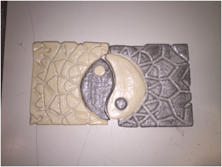
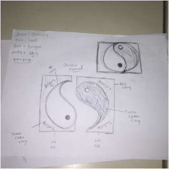
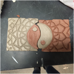
We were instructed to create two slab pieces that resembled opposites, while carving out designs. For this I decided to do the Ying and Yang, which is an example of Chinese culture of two becoming one. I found this project to be easier than the cup, mainly because I had an idea and stuck with it. Once my pieces became leather hard, it was really easy to construct was I was looking for. I made four slab tiles half with the red clay and half not. I think cut out a circle in both and measuring it. The hardest part about this whole project was trying to stick the two half circles in the area I left in the slab. becuase they were so hard, I could not blend them together. I had to use slip, which was a different color than the red clay. It proved to be difficult because I did not want this color clay showing on the red clay. However I let it dry and then carved it out, which was ultimately successful. This glaze on this is really upsetting to me, mainly because of its reaction on the red clay. Instead of forming a smooth coat over it, it bubbled and looked really ugly. I didn't realized that glazes react differently on each type of clay. Overall, I thought this project was really fun, I enjoy carving into clay, however I learned my lesson on glaze. I need to research how it reacts to certain types of clay.
We were instructed to create two slab pieces that resembled opposites, while carving out designs. For this I decided to do the Ying and Yang, which is an example of Chinese culture of two becoming one. I found this project to be easier than the cup, mainly because I had an idea and stuck with it. Once my pieces became leather hard, it was really easy to construct was I was looking for. I made four slab tiles half with the red clay and half not. I think cut out a circle in both and measuring it. The hardest part about this whole project was trying to stick the two half circles in the area I left in the slab. becuase they were so hard, I could not blend them together. I had to use slip, which was a different color than the red clay. It proved to be difficult because I did not want this color clay showing on the red clay. However I let it dry and then carved it out, which was ultimately successful. This glaze on this is really upsetting to me, mainly because of its reaction on the red clay. Instead of forming a smooth coat over it, it bubbled and looked really ugly. I didn't realized that glazes react differently on each type of clay. Overall, I thought this project was really fun, I enjoy carving into clay, however I learned my lesson on glaze. I need to research how it reacts to certain types of clay.
|
|
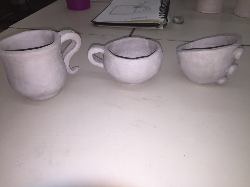
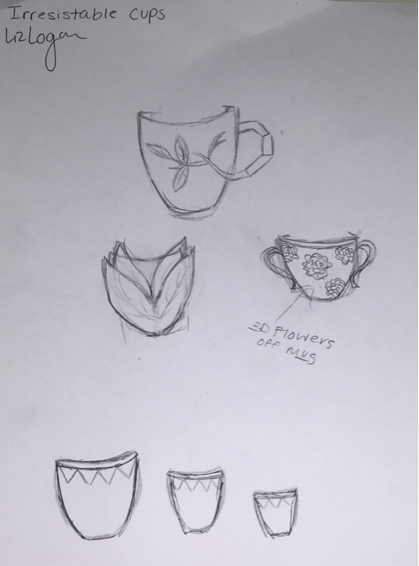
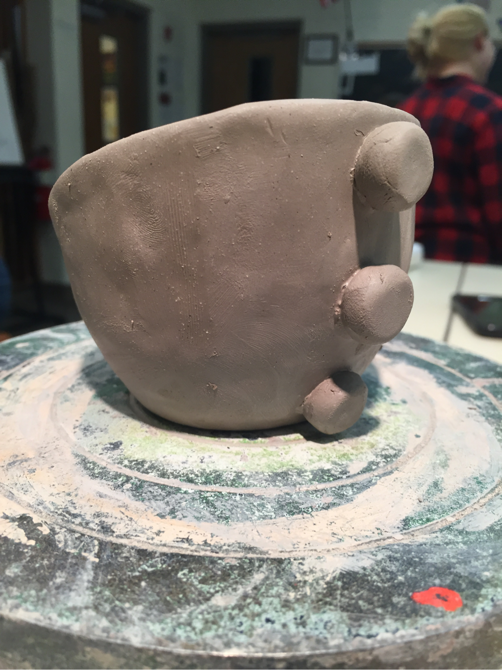
Irresistable Cups
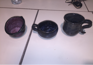
This was our first project. The task was to create three Irresistable cups, either by constructing or glazing. I should probably tell you what I think of when I see Irresistable. To me, it's simple, well crafted cups. I really wanted to incorporate this into my planning and creating process. I didn't want to go all out and create cups that don't even make sense for their intended purpose, instead I wanted cups that are simple and neat, and serve their purpose. As you can see, I didn't follow my sketches at all, I oringally wanted to go for a nature theme, and create a set out of that, but decided against it, due to my skill level and the amount of clay we received. (3 lbs) My favorite cup I created was the one with the three dots in the back, I pulled inspiration from a retro, 70's feel, sorta like a vintage chair, I thought it was cool. The glazes however was the downfall of the whole design, I feel that they did not come out as well as I had hoped. They were too dark and drowned the cups. Overall, I feel that this project was a good lesson of what glazes to use and how that will effect the feel and look of the pottery.
This was our first project. The task was to create three Irresistable cups, either by constructing or glazing. I should probably tell you what I think of when I see Irresistable. To me, it's simple, well crafted cups. I really wanted to incorporate this into my planning and creating process. I didn't want to go all out and create cups that don't even make sense for their intended purpose, instead I wanted cups that are simple and neat, and serve their purpose. As you can see, I didn't follow my sketches at all, I oringally wanted to go for a nature theme, and create a set out of that, but decided against it, due to my skill level and the amount of clay we received. (3 lbs) My favorite cup I created was the one with the three dots in the back, I pulled inspiration from a retro, 70's feel, sorta like a vintage chair, I thought it was cool. The glazes however was the downfall of the whole design, I feel that they did not come out as well as I had hoped. They were too dark and drowned the cups. Overall, I feel that this project was a good lesson of what glazes to use and how that will effect the feel and look of the pottery.
|
|
|
|
The first image is a piece from around the time period 1750. It's an example of English agateware. I like this piece because it's really interesting. The colors itself are really pretty and compliment very well. The use of two different colored clay to make a marble pattern is what intrigued me the most about this piece. This was probably made by a cast of the original pot. And wedging to different (iron oxide stained) pieces of clay together. The second piece is an example of native American pottery which uses slip application to create the illusion of two different types of clays. They apply black clay to a pot and carve out the negative space. I enjoyed this because it reminded me of the project I did last year which was really fun.
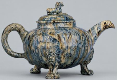
Staffordshire, ca. 1750. Lead-glazed agateware.
|
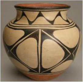
Santo Domingo jar which
uses negative space for design effects, 1915.
|
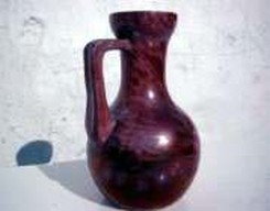
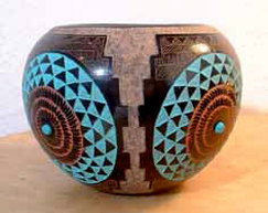
The artist of the first piece is a man named Herman August Kähler. He was a Danish artists who experimented with different types of glazes, trying to create the perfect red. This picture shows his one creation which later made him become famous. It is known as "Kähler red". It's a ruby color. I chose to share this piece because I thought the color was really pretty. It has a marble effect, which I really like. I think he made it by layering glazes on top of each other. The second piece is from Pueblo Indian Pottery. In the 1920's this technique was still used. They made these intricate designs by layering different glazes and paints. (With finely tipped brushes.) I chose this piece because I love how precise and detailed the glaze is on the piece.
|
|
The artist of the first one is Mary O'Malley. I chose to share this specific piece of hers, because I felt it shared a connection with light and dark. The pot itself symbolizes light and purity, but it is being tarnished by the dark, or in this case the black tentacles. I enjoy the imagery it suggests. I think the pot was made with porcelain and was probably thrown on the wheel. The tentacles were probably made with clay and glazed with matte color.
The second picture was pieces made by Taizo Kuroda. I decided to share these pieces because I love how simple and eloquent they are. There are really no imperfections, they are clean cut pots. They were made with porcelain, and probably thrown on the wheel.
The second picture was pieces made by Taizo Kuroda. I decided to share these pieces because I love how simple and eloquent they are. There are really no imperfections, they are clean cut pots. They were made with porcelain, and probably thrown on the wheel.
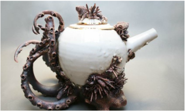
Artist: Mary O'Malley
|
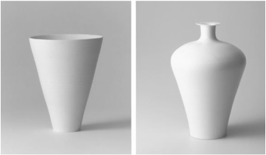
Artist: Taizo Kuroda
|
